




Responsive Web Design | Mobile-First Development
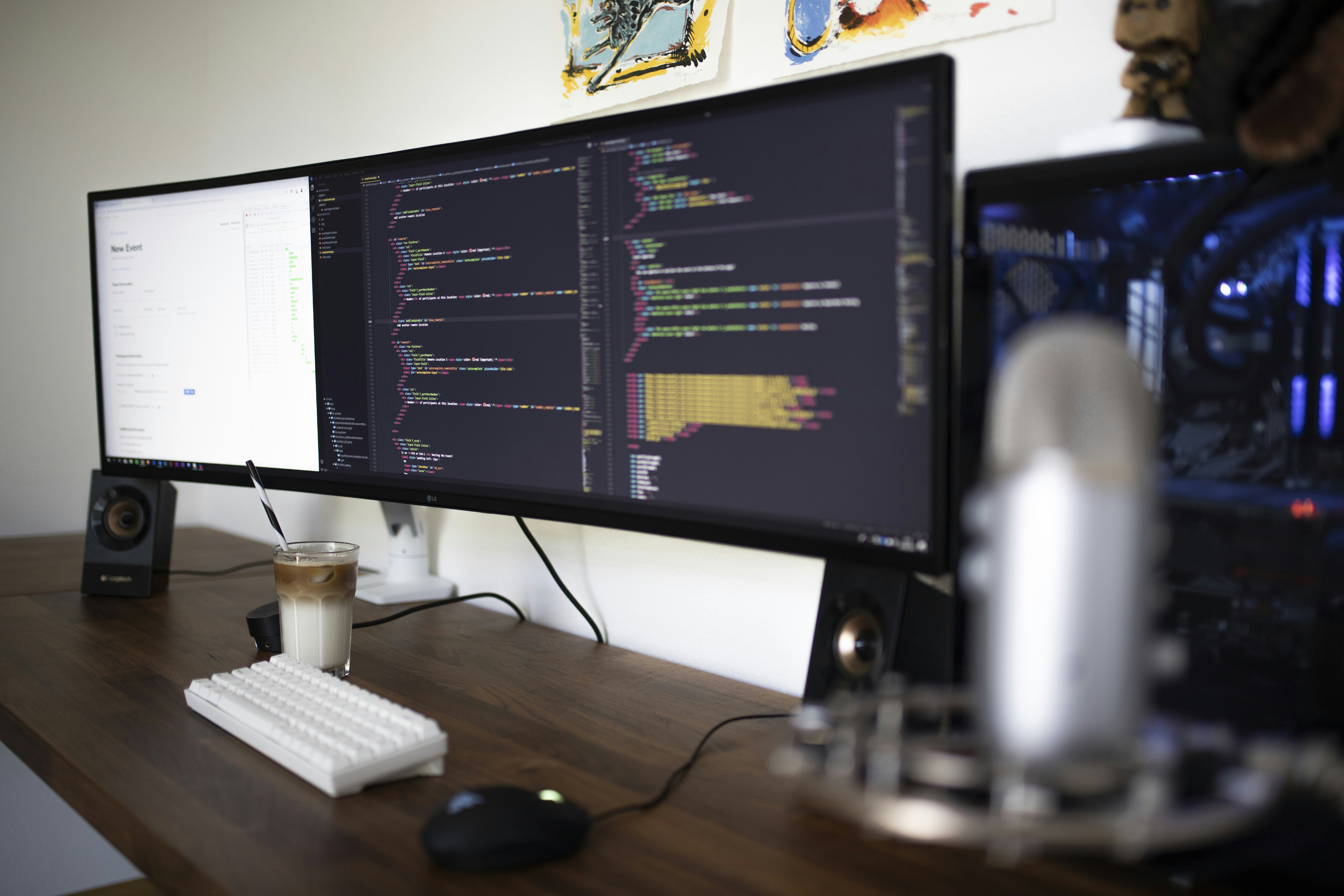
Master the multi-device digital landscape with our responsive web design services that ensure your website delivers flawless experiences across every screen size and device type. In today’s mobile-dominated world where over 60% of web traffic comes from mobile devices responsive design isn’t optional it’s essential for business success. Our mobile-first development methodology begins by designing for the smallest screens then progressively enhancing the experience for larger displays ensuring optimal performance and usability at every breakpoint. We implement advanced responsive techniques including fluid grid layouts flexible images CSS Grid and Flexbox creating designs that gracefully adapt to any viewport from smartwatches to ultra-wide desktop monitors. Our approach goes beyond simple scaling we optimize touch targets navigation patterns and content prioritization for each device category ensuring users enjoy intuitive interactions regardless of their chosen platform. We utilize modern CSS media queries viewport units and container queries to create truly adaptive layouts that respond not just to screen size but also to user preferences and device capabilities. Performance optimization is crucial for mobile users we implement lazy loading progressive image formats and conditional resource loading to minimize data usage and maximize speed on cellular connections. Our responsive designs maintain visual consistency while adapting layouts typography and spacing to provide optimal readability and usability across all devices. We test extensively using real devices and advanced emulation tools ensuring your website performs perfectly on iOS Android Windows and other platforms across various browsers and versions. Accessibility remains paramount throughout our responsive design process implementing touch-friendly interfaces keyboard navigation and screen reader compatibility for inclusive user experiences. We leverage modern frameworks like Bootstrap and Tailwind CSS when appropriate while maintaining clean semantic code that ensures long-term maintainability and performance. Our responsive solutions include adaptive images using srcset and picture elements delivering optimized assets based on device capabilities and network conditions. Choose our responsive web design services to future-proof your online presence and capture audiences wherever they browse.